Description
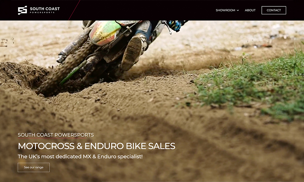
Motorcycle dealership branding and bespoke WordPress development.
Although the company has its roots firmly in motocross and off-road biking, SCP has plans to grow and accommodate other sports and vehicle types. Therefore the brand identity needed to be flexible enough to accommodate this growth, whilst still hinting at the team’s racing heritage.
The result was an S icon that evokes the checkered flag, fluttering in the wind on race day. The accompanying colour palette and font selection were bold, fitting nicely with the popular off-road motorbike brands that the target customer would be loyal to. We applied the new branding to a website design that would resonate with the target audience whilst retaining a high level of usability. Our sister agency, Devstars, took these designs and built a new e-commerce website, which allows visitors to reserve bikes, make enquiries and also offer their bikes for sale or part exchange.
We’re thoroughly pleased with the branding for SCP, which alongside the website, will help build a strong foundation for SCP as they forge ahead with their new business.
Related Websites
-
garmingpsconnect
by garmingpsconnect
622 -
Ahli United Bank
by Banking Consultant
1322 -
SOTD
Mist | Multi-Purpose HTML5 Responsive Template
by zozothemes
1320


