SkyCleansing
by urzhanovaa.design
Description
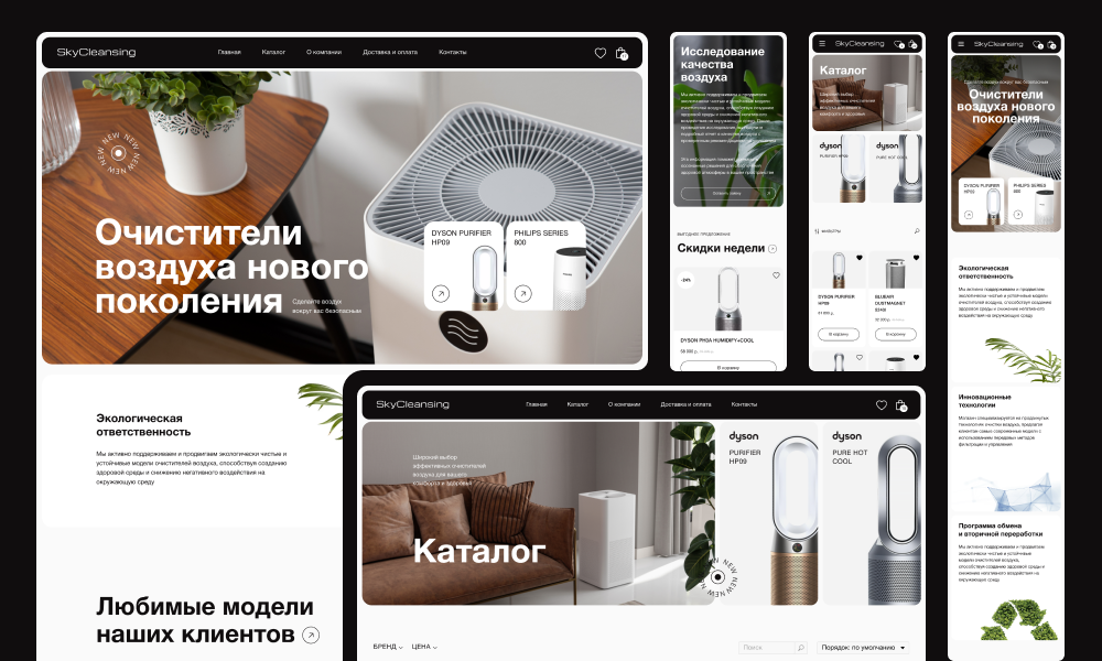
SkyCleansing, a virtual haven of harmony and freshness, represents an online store that seamlessly blends exceptional functionality with sophisticated design in the air purifier sales domain. Within its virtual corridors, innovative technologies and refined bento style converge, creating a unique experience for visitors.
Minimalism and Purity: The design of SkyCleansing strives for perfection in minimalism. A white background, smooth lines, and neat elements convey a sense of simplicity and cleanliness, emphasizing the core concept of air purification. The Bento style is used to create harmony in presenting products and draw attention to their aesthetics.
Intuitive Navigation: A key design feature is intuitive navigation, allowing visitors to easily navigate the store. With minimal extraneous details, user-friendly interfaces, and clear category structures, users can effortlessly find the products they seek.
Bento Style: The store interior is styled like a bento box, where each product is presented as a unique dish. Product images are framed in a manner reminiscent of bento boxes, providing the store with a sense of harmony.
Graphics and Illustrations: SkyCleansing's graphics combine modern trends with traditional motifs. Each product is accompanied by detailed illustrations highlighting its functionality and style. Snowy-white tones harmonize with pastel accents, creating an atmosphere of freshness and purity.
Responsive Design: SkyCleansing offers a quality user experience on any device thanks to its responsive design. This allows customers to enjoy the store's aesthetics regardless of whether they are using a tablet, phone, or personal computer.
SkyCleansing is more than just a store; it is a virtual reality of cleanliness, where modern technologies and visual art merge into a unified whole, inviting visitors on a journey into the world of clean air.
Related Websites
-
Hello Chocolate
by Hello Chocolate
749 -
SOTD
Gthin Fitness Center Landing Page HTML5 Template
by Slidesigma
921 -
SOTD312


