Redox Website Redesign
by
Description
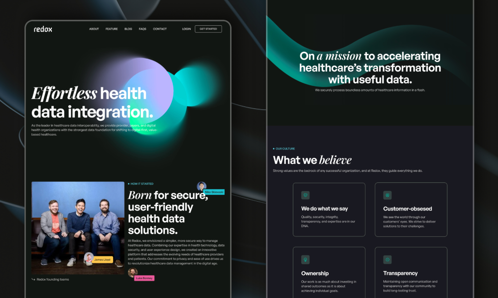
My design focused on creating a modern visual language that resonates with the tech-savvy and diverse audience of Redox. The updated aesthetic incorporates sleek, intuitive design elements that align with contemporary web standards, enhancing the site’s overall appeal and usability.
Key improvements include:
• Enhanced Visual Communication: I employed a clean, modern design to showcase Redox’s technology. This visual approach highlights the sophistication of Redox’s offerings, making complex information accessible and engaging.
• Clear Product Introduction: The new layout provides clear, concise product descriptions and value propositions, enabling visitors to quickly grasp Redox’s benefits. This is crucial in healthcare, where stakeholders need to understand product efficacy and safety at a glance.
• Improved User Experience: By streamlining the navigation and optimizing the user flow, I ensured that visitors can easily find relevant information and resources. This user-centric approach reduces cognitive load and enhances the overall browsing experience.
• Value for Healthcare Product Design: The redesign emphasizes user-centric principles, critical in healthcare product design. By prioritizing accessibility and inclusivity, I ensured the website meets the needs of diverse users, including healthcare professionals and patients with varying levels of technical proficiency.
• Responsive and Adaptive Design: The website is fully responsive, providing an optimal viewing experience across devices. This flexibility is essential for healthcare professionals who often access information on the go.
Through this redesign, Redox’s website now effectively communicates its innovative technology and value proposition, fostering trust and engagement with its audience. The project exemplifies my commitment to leveraging UX design to enhance healthcare technology and improve user interactions.
Related Websites
-
clipping path king
by clipping path king
361 -
Subraa
by Subraa
1921 -
Digital Utilization
by BM Digital Utilization
536


