Description
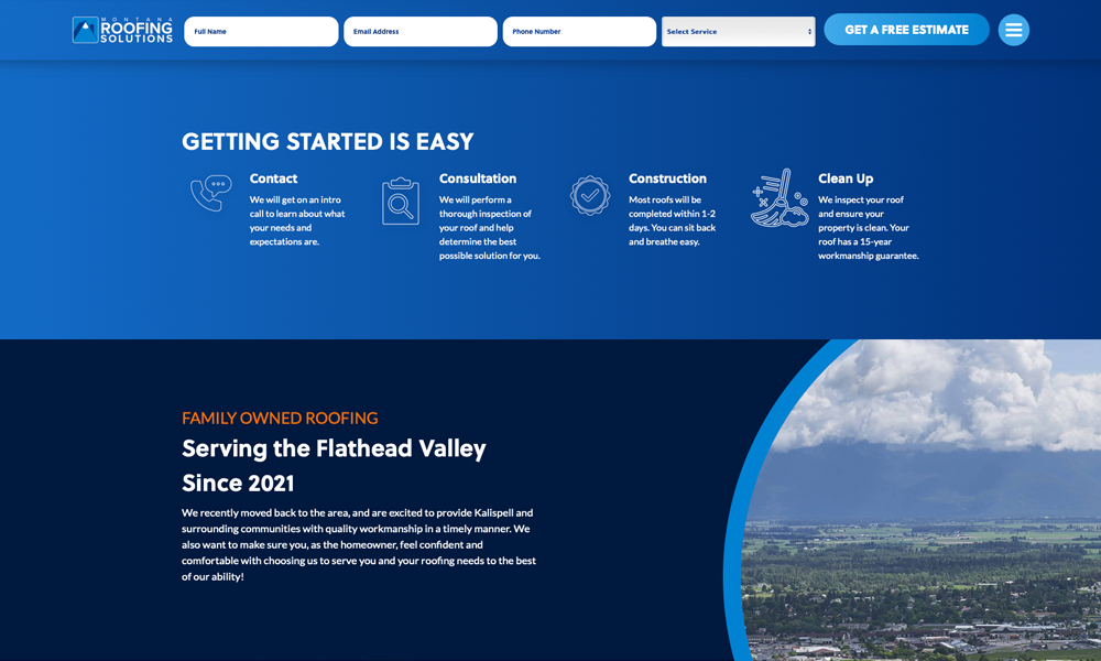
This Kalispell roofing company site shows that a roofing company website doesn't have to be boring.
With large photography, flat design and subtle gradients – it elevates the design while being persuasive with reviews, manufacturer badges and smiling faces.
Roofing company websites can be colorful, exciting and friendly. But in the past many roofers have not had the pleasure to have a website like this represent them. I strongly suggest you take inspiration from this site, and sites like Dribbble, Pinterest and larger city Roofing companies so that you can break out of your mindset of what a roofing company site can be.
It can also be useful to tap into other industries, like software and medical sites so that you don't just copy the other roofing companies – they often provide innovative features and looks that many construction sites don't have.
But in the end – it's all about:
1. Does this website get traffic (Search Engine Optimization focus.)
2. Do the people that come to this website actually turn into customers (Conversion optimization / persuasion.) I invite you to check out Montana Roofing Solutions full site, and ask yourself this question: why does this site persuade people to work with them? Tweet at @hookagency if you have any suggestions for improvement, or if you like the design!
Related Websites
-
resellersitehub
by Thomas Shaw
1975 -
SOTD1320
-
souravps
by Sourav
1013


