Description
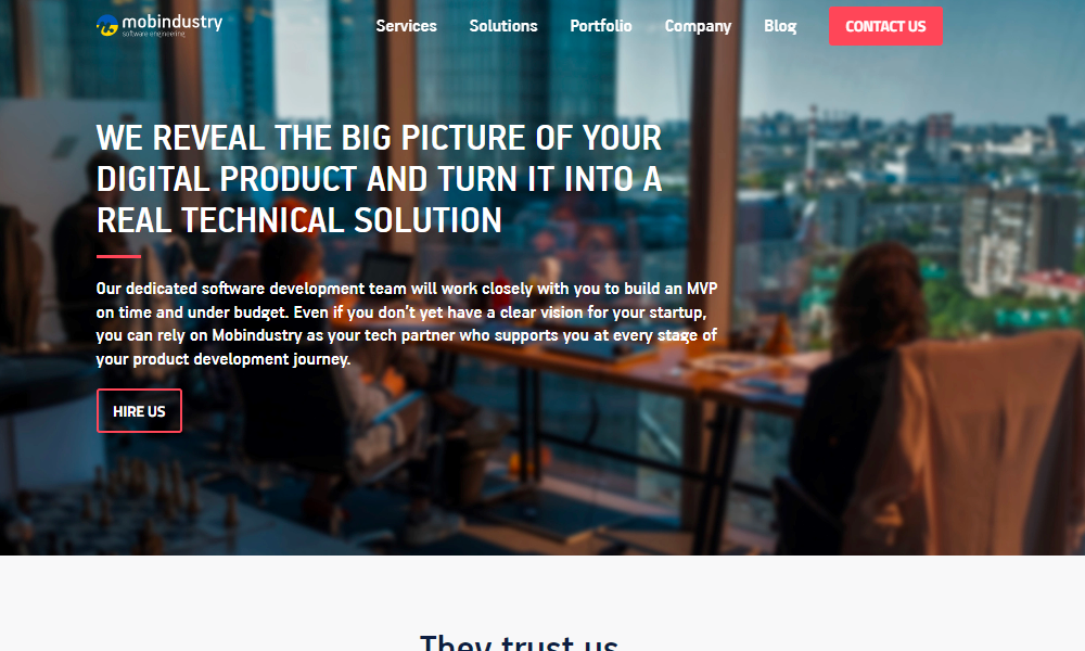
The website design of www.mobindustry.net is sleek and clear. The color scheme features shades of blue, white, and gray, which create a clean and minimalist aesthetic. The homepage has a simple layout with a full-width header that includes the company logo and a concise navigation menu.
Below the header, there is a large hero image with a prominent call-to-action (CTA) button that invites visitors to learn more about the company's services. The hero image is visually appealing and showcases a mobile app on a smartphone screen, which aligns with the company's focus on mobile app development.
Scrolling down, the website presents a series of sections that highlight the company's expertise, services, and projects. These sections are organized in a grid layout with clear and concise titles, accompanied by relevant icons or images that add visual interest. The use of ample white space and consistent typography makes the content easy to read and visually appealing.
The website design is responsive, ensuring that it is accessible and functional on different devices, including desktops, tablets, and smartphones. The overall design is user-friendly, with intuitive navigation and clear CTAs throughout the website, making it easy for visitors to find the information they need and take action.
Related Websites
-
SOTD
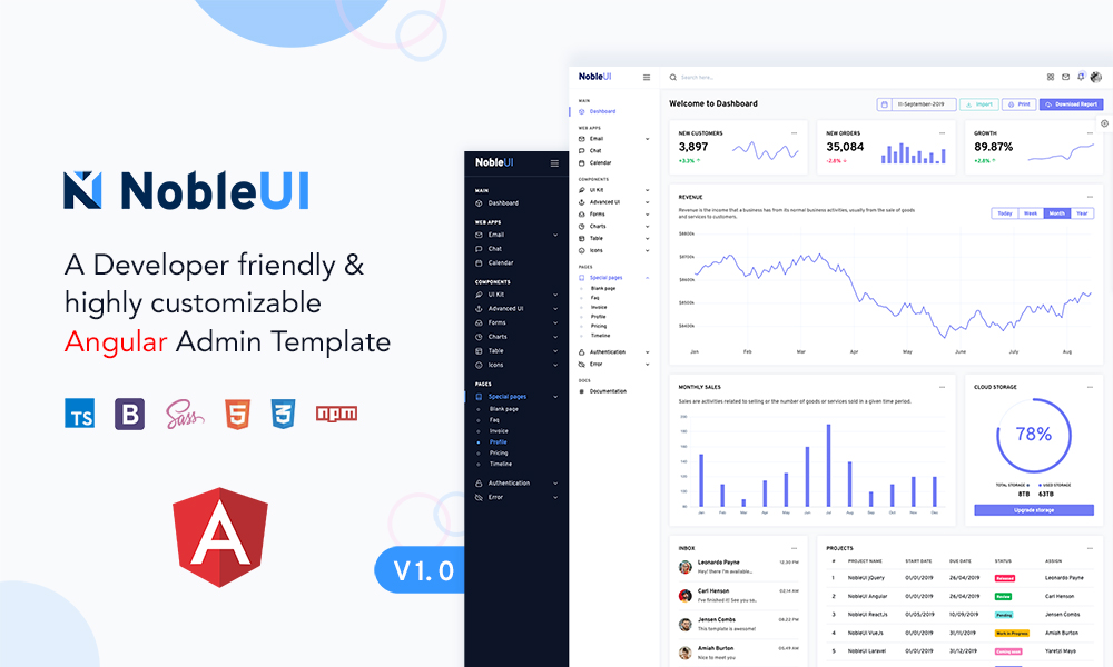
NobleUI - Angular 10+ Admin Template
by noble ui
1343 -
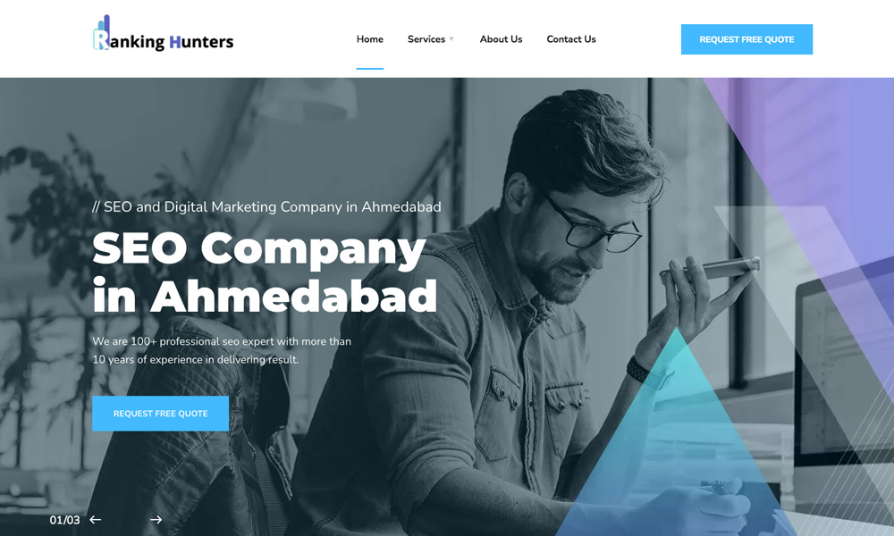
Rankinghunters
by Ranking Hunters
1296 -
SOTD
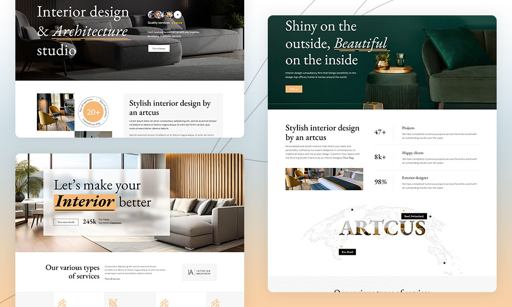
Artcus - Interior Designer & Architecture WordPress Theme
by Cymol Themes
538


