Description
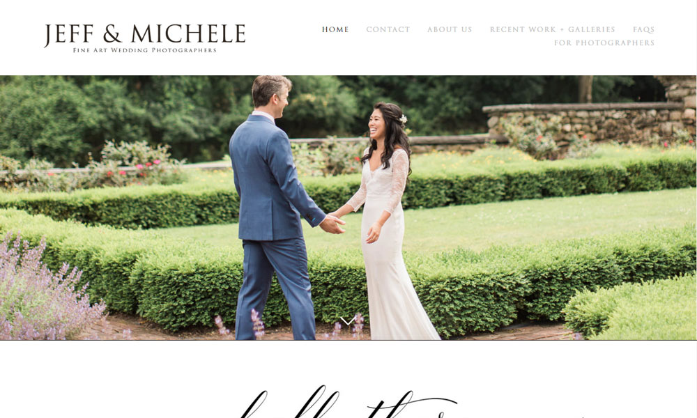
As Louisville wedding photographers, Jeff & Michele need to stand out among other wedding photographers in their area without being flashy. The exclusion of complex graphics and other distracting elements highlights the simplicity and beauty of their brand and portfolio.
By showcasing the larger banner parallax images as section intros to key aspects of Jeff & Michele's wedding photography brand, we avoid being overly focused on a single image as many common photography websites that typically display a large front page image. In this way, the visitor is not only brought to look upon a single image, but is rather gradually guided into a call to action (to contact Jeff & Michele); the visitor catches a glimpse of who Jeff & Michele are, why they do what they do, why it is with excellence that they do it, and then invited to be a part of that experience.
Related Websites
-
dusmart
by Dusmart
1278 -
Canopy Tech
by Canopy Tech
1349 -
2648


