Lenhardt & Lenhardt
by feelErfolg webdesign
Description
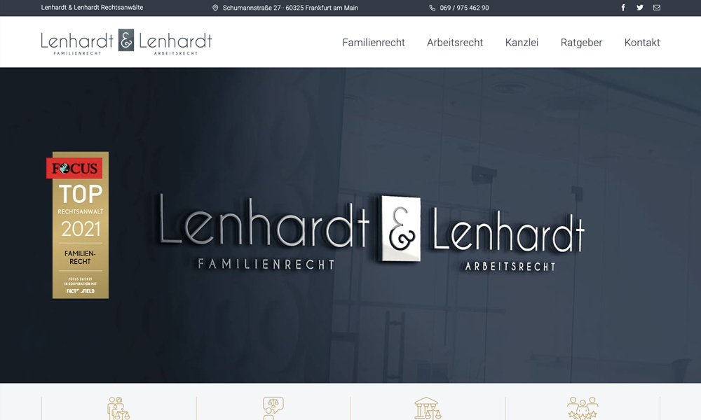
The web design of Lenhardt & Lenhardt is an epitome of professionalism, reflecting the firm’s commitment to providing top-tier legal services. The color scheme is predominantly white and blue, exuding a sense of sophistication and trustworthiness. Consistent visual elements throughout the site reinforce branding.
Upon landing on the homepage, visitors are greeted with a clean, minimalist banner featuring a high-resolution image of Frankfurt’s skyline, subtly hinting at the firm’s local focus. The typography is modern yet traditional, which aligns perfectly with a law firm that values both innovation and tradition.
The website employs a clear, hierarchical layout with well-organized sections that make information easily accessible. Pages load quickly and transitions are smooth, ensuring an optimal user experience even for those with slower internet speeds. Navigation is straightforward thanks to a prominently displayed menu bar at the top.
One standout feature is the multilingual capability which indicates inclusivity and global reach — users can seamlessly switch between German, English and French versions of the site as per their preference.
To further enhance usability, there are distinct call-to-action buttons placed strategically across the site encouraging visitors to contact or learn more about the services offered by Lenhardt & Lenhardt.
Overall, this web design successfully combines aesthetics with functionality to deliver a seamless user experience while effectively communicating its brand identity and core values.
Related Websites
-
SOTD
Digital Profile
by Daniel Lewis
1878 -
Techindiasoftware
by Techindiasoftware
1448 -
Mighty Fox Studios
by Might Fox Studios
813


