06 Dec 2017 Site Of The Day
KARE online store
by ARTW
Description
Creation of the biggest in Russia online store for KARE, the international manufacturer of design furniture and interior accessories.
Products in interiors
KARE Design threats every interior solution individually and grants the original luxury products.
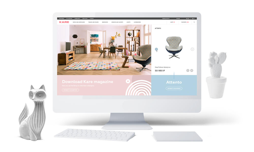
To show the main idea behind the brand we added new visual style to regular catalogue and present products in interiors from KARE lookbooks. Customers can see how every item will look in their home, how it suits the interior in general and also how various products from different KARE collections can blend into one interior solution.
Product cards
To focus customers on the products only we decided to go with minimalistic design and combined minimal number of colors on product cards.
The only exception is the colorful icons for new, hot and items for sale. These icons give customers all the necessary information quickly and still focus their attention on the products only.
Style filters
There are various filters in the store catalogue to make the search easier: by price, color, purpose,collection and materials it was manufactured from. Moreover, there is additional filter by designing style. Customers are just one click away to find themselves in industrial loft, scandic home, glam rock apartment or even on the cocktail party straight from the 60ies.
New menu
Before redesign all menu sections, including the catalogue, were hidden under burger menu. In current store we decided to make user’ search for the product faster and put all catalogue sections directly into the colorful header.
Such approach shortened customers scenario and gave us the right to leave out the burger menu completely.
Responsive design
One of the main challenges was to save the logical structure of the website on various screens and devices. We make it happen by bringing in a block structure that can easily and quickly adapt to any resolution.
Products in interiors set the main style and mood, the next element show the product selected from all angles while next block suggests to find out all the details about interior and collections that are forming it.
Additional blocks
We didn't want to overload customers with tons of information and didn’t want to mix various collections, that is why we divided interiors by additional blocks with minimalistic design.
Processes optimization
We synchronized all website data with 1C-Bitrix in real time. Any change on the website or in 1C, such as orders processing, new arrivals and time of delivery updates, are seen instantly.
We developed wide range of custom scenarios like access to warehouses, partial payment and reservation of items from the catalogue.
Optimization of processes almost excluded the number of errors while working with website.
Related Websites
-
SOTD1070
-
SOTD
GR Capital
by Sponge D&D
5462 -
SOTD1898


