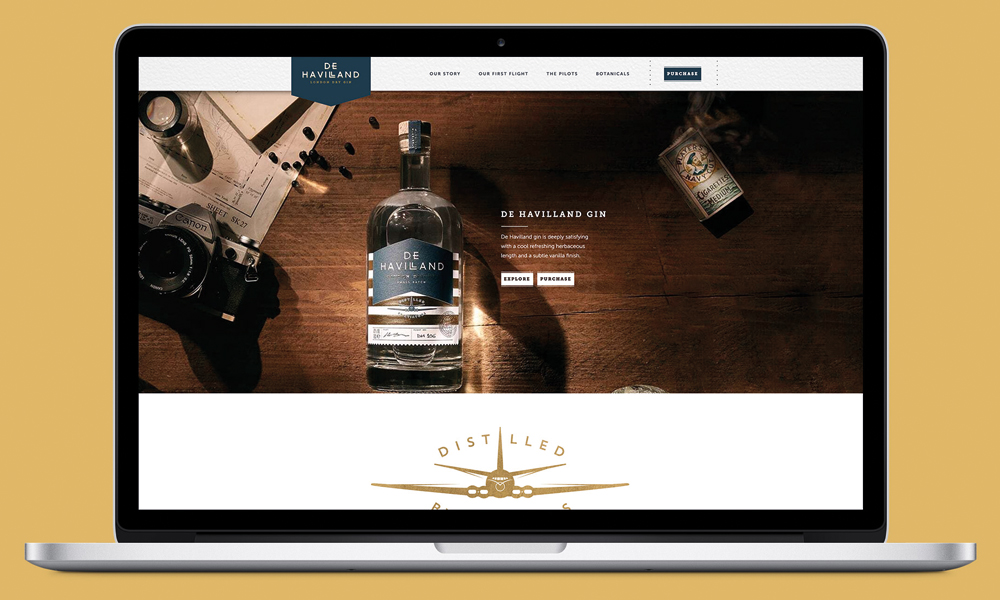
De Havilland Gin
by London Web Design Agency
792
Description
LWDA were tasked with creating a beautiful website presence for the launch of De Havilland Gin.
The client requested the design should follow the style and character of the bottle label and that the visitor should be able to purchase the Gin direct from the site.
The site needed to be simple, clean and informative. Giving context to the brand name and helping to build the brand world for future expansion.
With only a single product available at this time, we felt there was no requirement for a multi-page website.
A slick one-page website would be enough at this stage of the brands’ development to promote the product and convey the quality of the brand.
Related Websites
-
1596
-
SOTD2766
-
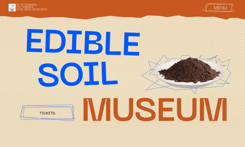
Edible Soil museum
by Julia Semenova
842


