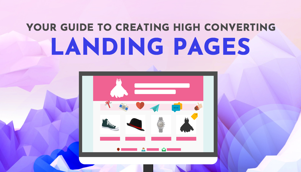
Your Guide to Creating High Converting Landing Pages
Do you ever wonder why some businesses see so many conversions with their landing pages but your website sees only a fraction of this? It could have something to do with how your landing page is designed, laid out, or that your offer isn’t appealing to your customer base.
There are ways to correct this and build landing pages that help convert visitors into customers. If you’re not sure where to begin, that’s quite alright - we can help!
We’re going to give you the details that you need in order to build a landing page that works well for your business and helps you see better conversion rates than you thought possible! Keep reading for more information!
A Brief Synopsis of a Landing Page
Your homepage is a comprehensive website that includes all of your business. Generally, this page will have links to any e-commerce that is for sale, a blog, how to contact you, FAQs, an “about” section, and other pertinent information.
A landing page is usually a page that is found by a user by clicking on a link from another source. This page isn’t necessarily a full website, but rather a way to capture information in exchange for some type of offer.
This offer may be access to exclusive content, a promo code, free merchandise/shipping, or any other ‘gift’ you may be willing to give. However, in order to receive whatever it is you’re offering, that user must do something for you. This ‘something’ is usually along the lines of signing up for a free trial or subscribing to your blog by entering their name and email.
The idea of a landing page is a trade of sorts: you make an irresistible offer and that user ‘converts’ by following the call to action (whatever that may be.)
Grabbing a User’s Attention
The text on a landing page is meant to be kept relatively short and sweet. You’ll want a header, possibly a subheader, an explanation of your offer, and what the user must do to obtain it.
You will also need either social proof (think testimonies or company badges,) verifiable statistics, if possible, or company badges showing that larger businesses trust your product. This should be done in moderation, though, as you don’t want your landing page to become cluttered or confusing.
Being that the internet is a global phenomenon and people from numerous countries can (and hopefully will) access your website, you don’t want to have it become lost in translation. Unfortunately, Google Translate doesn’t always do the best job and your message can easily be misinterpreted.
This is why you need to translating your landing page. No, translating your landing page isn’t mandatory, but why risk losing potential sales because of a language barrier? A page that can be read and understood in many languages will see a far better conversion rate than one that is only written in your native tongue.
Get Ahead of the Competition
The idea of a landing page is to have users convert into customers. If you’re having a hard time doing this or want to stay ahead of the competition, there is only one way to do this - and it is to track their changes.
The changes your competitors make could be SEO-related, adding new languages to their website or landing page, or changing their call to action. Many smaller businesses don’t have enough staff to handle their daily tasks plus identifying changes to their competitor’s websites.
Services like Competitors App can actually do this for you. Although there are multiple websites that offer this type of tracking, you should use a company that will be able to track the correct data from your direct, indirect, and replacement competitors. All of which are ways to gather competitive intelligence that can be used in other facets of your business as well!
Limit Navigation
Ideally, your landing page will be just that: a page that people land on by clicking a referral source. The goal is to convert them into buyers or subscribers right away, not to have them dig around in your site and forget the whole reason they found your page in the first place.
With this said, keep your landing page simple, clean, and free of ways to navigate away from it. If anything, once your potential customer completes the call to action, route them to your full website instead of potentially losing a lead due to a short attention span and too many places to click!
Although simplicity is key, you should build trust with your potential customers by giving them the option to view your privacy policy. It’s not required for every business, but it will definitely help users feel a bit safer when giving you their information. This policy is one link that can easily be included and is rarely clicked (seriously, how often do you actually read a privacy policy?).
Using Your Newly Gathered Data

The goal of your landing page may be having potential customers make a purchase or become a subscriber to your blog. Whatever the goal, you will likely have captured a bit of data, including the user’s email address.
In order to help convert a one-time buyer or visitor into a loyal customer or reader, you should consider sending out a survey. A customer satisfaction survey will allow you to determine what your company is doing well and where you need improvement.
This process doesn’t have to be complicated; in fact, you can use a simple survey template to gauge how you’re doing and your consumers’ perception of your company. Surveys also allow customers to feel as though their concerns are being heard and addressed, which means that even a bad experience can have a positive outcome!
One Size Doesn’t Fit All
The last thing you need to know about creating landing pages with high conversion rates is that not every page is going to work for every market segment. Ideally, with each new marketing campaign or available offer, you will create a new landing page.
Given the fact that landing pages are intended to be simple, this shouldn’t be a difficult task and once you have the format that works for you, it should turn into a simple ‘plug and play.’ Basically, plug in the information and images that are applicable and publish that page!


