Web Design Tricks to Grow Your Business Fast
The world is adapting to the changes that it encounters, and so should you. Since the dawn of the World Wide Web in 1989, the number of websites created have reached billions in a span of three decades.
As of now, there are over 1.74 billion websites that everyone can access. These websites are accessible to over 4.5 billion people around the world.
If you look at the numbers, setting up an internet business is a significant investment. It entails prospecting, sales, and profit. But, to have your investment succeed, you’ll need your online business to be working well. .
Your website is the face of your business. It says a lot about your company, what you do, what services you provide, and what other people think about your business. It also serves as the bridge between you and your prospects.
Whether you’re a novice in web designing or an owner of a well-structured website, you will always be able to find a website that is more attractive than yours.
Making a website is not just about adding every feature to your website and making it colorful. It’s about bringing a human touch to your site so that your customers can feel connected with your website, and ultimately your business.
But, what does it take to make the perfect website for your business? Here are some tips and tricks you’ll need to make your website stand out from the competition:
Tips and tricks to design your business website
1. Focus on your landing page
Your landing page is everything. When people find your website from other blogs and referrals, the first thing that they will see is your landing page.
Your landing page should say a lot about your business. Everything that you want your customers to know is on this page. This includes your product/s, reviews about your business, contact information, and the like.
You should have every functionality your website offers on this page. This allows easy access when visitors land on your website.
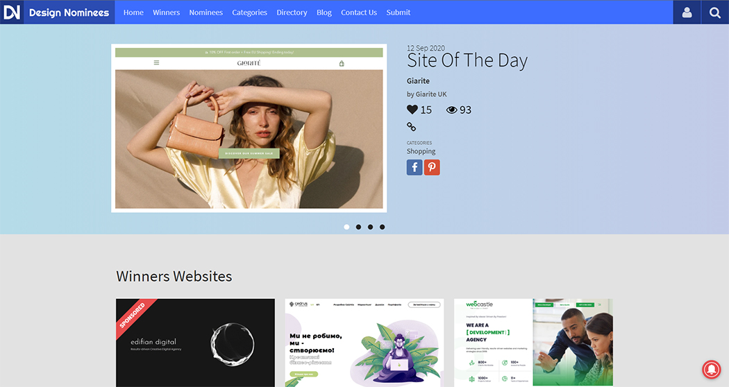
A minimalist but all-around landing page from Design Nominees.
The landing page of Design Nominees gives information about a highlighted website’s features. You can also access their contact information and blog through their landing page.
Designing a perfect landing page isn’t rocket science, but you need to put in some extra effort for this. For this project, one size does not fit everyone. Thus, your landing page should cater to the needs of your customers.
Pictures, videos, and other visual aspects of a website should be on your landing page. Your landing page is not the place to cram in Photoshops, every design or graphic feature, and irrelevant visuals. This page sets the tone of your business in the online world.
2. Make your website interactive
Aside from offering functionality on your website, you should also make it interactive with your audience. Admit it, a website that has moving and interactive elements is more engaging than that of a stagnant one. You just can't resist it.

Species in Pieces’ website has a very catchy animation about endangered species.
Since this trend hit the web design world in 2018, you can find tons of websites with interactive graphics. Try it on your own and see what animation you can include to improve your website.
Don’t stray too far because you may find yourself putting a lot of graphics and interactive elements on your website without considering their functionality. Remember that your website is to serve the purpose and meet the goals of your business. Stick with it.
3. Eye-candy
Now, when your website is engaging, your visitors will stay longer. Having a dark mode, layers, floating objects, and futuristic color schemes are some of 2020’s trends in web designing.
Dark mode
Since we can spend hours and hours surfing the web, finding a website that has a dark mode can be visually soothing. Dark mode, aside from looking sleek and modern, makes other elements of your website stand out.
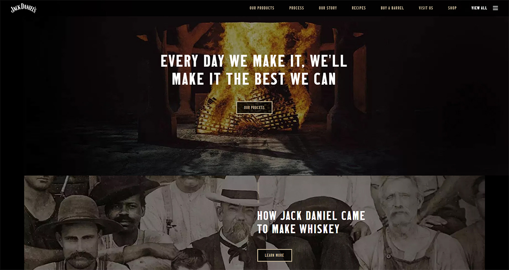
Jack Daniel’s, a famous liquor brand, uses a dark theme for their website.
Dark themes also jive with different futuristic and flashy themes that are also trending. Black enhances other colors by providing contrast and makes your website look dynamic without being harsh on the eyes.
Layers and floating objects
Adding floating elements and putting one object on top of another negates the fact that your screen is two-dimensional. 3D technology is an up and coming trend for the future of web design.
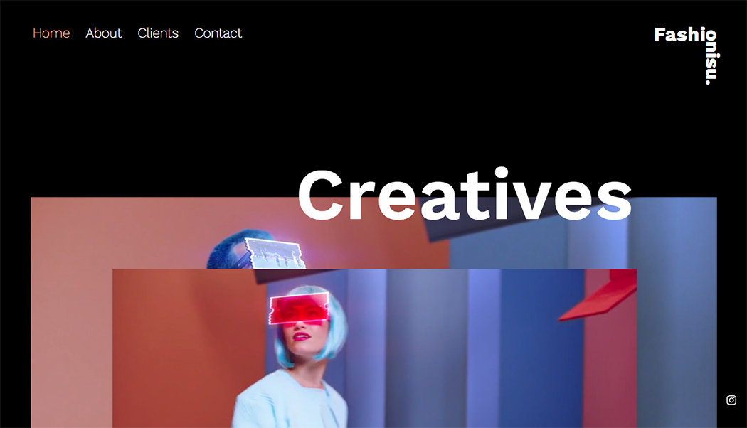
Multiple layers give a pseudo-3D vibe and increase the aesthetics of the website.
Layering objects creates a pseudo-3D effect. Partner this with shadowing and floating objects and your website will have that 3D impact for your audience.
Futuristic and cyberpunk color themes

A cyberpunk-themed cargo and storage business website.
Who would have thought that a cargo and storage website can look this cool? I haven’t! It only goes to show that you can make your website pleasing to the eye using unusual cyberpunk themes.
These kinds of color schemes involve a mix of neon colors of blue, violet, pink, and other flashy colors. This theme gives a futuristic and energetic vibe to your website.
It also highlights the message on your landing page. While serving the purpose of aesthetics, it also subtly suggests that your business is up to date in technological advancements.
4. Whitespace
The last few years have been directed toward intense design styles for websites. This time, it's the opposite. Negative space (whitespace) is the area on your website in between graphic designs. Whitespace can be any solid color, but most people use white.
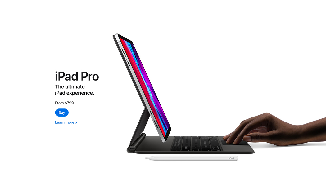
One of the largest users of whitespace is the Apple website.
Whitespace gives your screen a more breathable, spacious design. It also allows you to focus on other elements on a webpage, specifically the call-to-action elements.
5. Use WordPress to create a website
With the launch of WordPress way back in 2003, creating a website has never been easier. Even without knowledge of specialized coding, you can still personalize a website to your specifications using WordPress website design.
You can create your website based on several themes offered by WordPress. Themes are like tool kits that you will use to build your website. If you are looking for a specific functionality that’s not included in the theme, you can always add one of the many plugins that WordPress offers. For example, you can add a WordPress table plugin to create comparison tables for various products or to display data beautifully.
Aside from being easy to use, WordPress is free! You don’t need to spend a lot of money to create your website. With the amount of functionality that this content management system (CMS) gives its users, you’ll only need to pay for the annual hosting and domain.
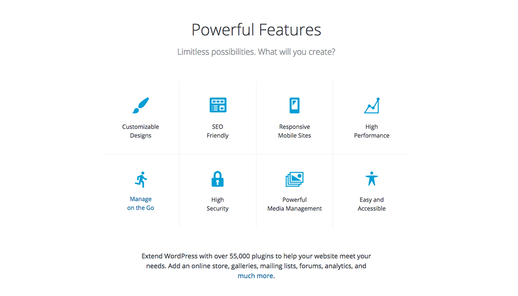
This image showcases the features of WordPress.
Because of its reliability, 35% of all websites use WordPress. Small, startup businesses like Kokoon are now growing faster and faster because of how their website markets their product. Even megacompanies like Microsoft use WordPress for their website.
Final Word
Developing a website for your business dramatically increases the number of potential customers visiting your site; opening new opportunities for your business to flourish.
Whether you're a beginner or an expert in website development, these tips and tricks will help you achieve your business as well as career goals.


