Visual Branding: Creating Memorable Logos and Graphics for Businesses
Ever heard the saying, "You never get a second chance to make a first impression?” Well, that's especially true for businesses. The way your brand looks — your logo, colors, even the fonts you use — tells a story about who you are and what you value. This is your visual branding, and it's a perfect way to connect with customers and make your business memorable.
In this blog, we;ll share the elements that make up a strong visual brand. We'll show you how to create a logo and graphics that represent your business, and how to use them consistently across all your platforms to leave a lasting impression.
The Core Elements of Visual Branding
Here are the key elements of visual branding.
Logo
According to Eran Mizrahi, CEO of Ingredient Brothers, “Your logo is like your brand's signature — it's the most recognizable part of your visual identity. A great logo is simple, memorable, and represents the essence of your brand. There are a few different types of logos. “
- This is just your brand name written in a stylized way (think Coca-Cola or Google).
- This is a simple icon or symbol that represents your brand (like the Apple logo).
- This is a more conceptual design that doesn't directly represent your product or service, but evokes a feeling or idea associated with your brand (like the Nike swoosh).
- This combines a wordmark with a pictorial or abstract element (like the Burger King logo).
No matter which type you choose, your logo should be versatile enough to work in different sizes and across various platforms.

Color Palette
Colors leave a deep impact on our emotions and perceptions. Think about how you feel when you see a bright red sports car versus a calming blue spa logo.
So, choose a color palette that aligns with your brand's personality and the feelings you want to evoke in your customers. Here are some common color associations.
- Red: Excitement, passion, energy
- Blue: Trust, stability, calmness
- Yellow: Optimism, happiness, creativity
- Green: Nature, growth, health
- Orange: Warmth, friendliness, fun
- Purple: Luxury, sophistication, mystery
- Typography: Speaking Your Brand's Language
Fonts
Just like colors, fonts have a personality too. The fonts you choose for your logo, website, and marketing materials should complement your overall brand image.
- Serif fonts (like Times New Roman) are often seen as classic, traditional, and trustworthy.
- Sans-serif fonts (like Arial) are usually perceived as modern, clean, and minimalist.
- Script fonts can feel elegant, playful, or even whimsical, depending on the style.
- Choose fonts that are easy to read and that fit the overall tone of your brand.
Imagery & Photography
The images you use should be consistent with your brand's personality and style. Whether you're using photos of your products, lifestyle shots, or graphics, they should all share a similar aesthetic. This might mean using a consistent color palette, editing style, or even the types of models you feature, adds Saba Mobebpour, CEO at DropGenius.
Graphic Elements
Graphic elements like patterns, icons, and illustrations can add a touch of personality and interest to your visuals. Use them strategically to reinforce your brand identity and create a more cohesive look across all your platforms.
Creating Your Brand's Visual Identity
Now that you understand the individual elements, let's talk about how to bring them together to create a knockout visual brand for your business.
Define Your Brand
Before you even think about logos and colors, take a deep dive into your brand's DNA.
- What's your mission? Why do you do what you do?
- What values are most important to your business?
- How would you describe your brand's personality? Fun and quirky? Serious and professional?
- Who are your ideal customers? What do they care about?
Once you have a crystal-clear understanding of your brand, you can start translating those qualities into visuals.
Research & Inspiration
Take a look at what other brands are doing, both in your industry and beyond.
- What logos catch your eye?
- What color palettes make you feel a certain way?
Create a mood board or Pinterest board to collect images, fonts, and design elements that resonate with you. This will help you get a feel for the visual direction you want to take, says Jimi Gecelter, CEO of Tradeit.gg.
Develop Your Logo
Your logo is the cornerstone of your visual identity, so it's worth investing time and effort to get it right. You can work with a professional designer or use one of the many online logo makers available. Either way, make sure your logo.
- Reflects your brand personality
- Is simple and easy to recognize
- Works well in different sizes and formats
- Is unique and memorable
- Choose Your Color Palette: Set the Tone
Think about the emotions you want your brand to evoke. Are you going for energetic and exciting (reds and oranges)? Calm and trustworthy (blues and greens)? Once you've narrowed down your options, create a color palette that includes primary colors, secondary colors, and neutral tones.
Select Your Typography
Choose fonts for your logo, headlines, and body text that complement each other and reflect your brand's tone of voice. Make sure they're easy to read both on screen and in print, says Martin Seeley, CEO of Mattress Next Day.
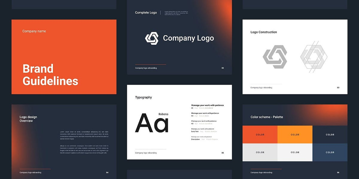
Create Brand Guidelines
Once you've finalized your logo, color palette, and fonts, create a brand style guide that documents all the details. This will ensure consistency across all your marketing materials, whether it's your website, social media posts, or product packaging. Your style guide should include.
- Logo variations (different sizes and color options)
- Color codes (CMYK, RGB, Hex)
- Font names and sizes
Implementing Your Visual Branding
Once you've nailed down your visual identity, it's time to unleash it into the world! This isn't just about slapping your logo everywhere — it's about strategically incorporating your brand elements into every customer touchpoint. Let's get into how to do that effectively.
Website & Online Presence
Your website is your online home, so it's the first place people will look to get a sense of your brand, adds Danny Jay, Marketing Director at SOLVED Consulting.
Make sure it's a visual knockout! Use your brand colors prominently, incorporate your fonts for headlines and body text, and make sure your logo is easy to find (usually in the top left corner).
If you have custom illustrations or patterns, weave those in to add personality.
Your social media profiles should reflect your brand identity. Use the same logo, profile picture, and cover photos across platforms. Post photos and graphics that align with your color scheme and overall style, adds Alex Taylor, Head of Marketing at Digital Signage NYC.
Marketing Materials
When it comes to brochures, flyers, business cards, or even ads, don't stray from your visual brand. Use those carefully chosen colors, fonts, and graphics. All of it can be created using PhotoADKing through its brochure templates, banner templates, and advertisements templates. Consistency is key here — you want people to recognize your brand instantly, no matter where they encounter it.
Product Packaging
If you're selling physical products, your packaging is an extension of your brand. Imagine the excitement of receiving a beautifully wrapped package with a sleek logo and a little thank-you note inside, says Alison Lancaster, CEO of Pressat.co.uk.
It's those little touches that leave a lasting impression. Incorporate your brand colors and patterns into the packaging, and don't forget to include your logo on the box or wrapping paper.
Retail & Physical Spaces
If you have a brick-and-mortar store or a pop-up shop, your visual branding should extend into the physical space as well. Use your colors on the walls, in the decor, and even in employee uniforms.
Incorporate your logo into signage and displays. Even the music you play can contribute to your brand's overall vibe. The goal is to create a cohesive experience that immerses customers in your brand, says Sumeer Kaur, Founder of Indian Dresses.
Don't Forget the Little Things
Your visual brand should go beyond the obvious. Think about the little details.
- Email signatures: Use your brand colors and fonts, and include your logo.
- Social media graphics: Create templates for your posts and stories that incorporate your brand elements.
- Presentation slides: If you're giving a presentation, use your brand colors and fonts to create a professional and on-brand look.
Maintaining and Evolving Your Visual Brand
Creating a strong visual brand isn't a one-and-done deal. It's an ongoing process that requires attention and care. Here's how to keep your brand fresh, relevant, and recognizable as your business grows.
Consistency is Key
Think of your visual branding like your wardrobe. You wouldn't wear a suit to the beach, and you wouldn't wear flip-flops to a job interview. Consistency in your visual branding creates a sense of familiarity and trust.
When people see your logo, colors, and fonts used consistently across all your platforms, it reinforces your brand identity and makes you more memorable.
Don't be afraid to experiment with different applications of your visual elements, but always stay true to your core brand guidelines. This means using the same logo, color palette, and fonts consistently in your marketing materials, social media posts, website design, and even product packaging.
Adapt to Trends
Chase Hughes, Founder of ProAI explains, “The world of design is always growing, and it's important to stay up-to-date with the latest trends. This doesn't mean you have to completely overhaul your brand every time a new trend emerges, but paying attention to what's popular and seeing if there are ways to incorporate fresh elements into your visual identity.”
For example, you might update your website design with a more modern layout or refresh your color palette with a few trendy shades. However, be sure to maintain the core elements of your brand, like your logo and overall aesthetic, so that your visual identity remains recognizable.
Measuring Success
How do you know if your visual branding is working? It's not always easy to measure, but there are a few key things you can track.
- Brand recognition: Conduct surveys or polls to see how well people recognize your logo and brand colors.
- Customer perception: Ask for feedback on your visual branding to see if it resonates with your target audience.
- Social media engagement: Monitor how people interact with your visual content on social media (likes, shares, comments).
- Website traffic and conversions: Track if changes to your visual branding lead to an increase in website traffic or sales.
Wrap Up
Visual branding isn't just about having a pretty logo. It's about creating a lasting impression, connecting with customers, and setting your business apart, says Gerrid Smith, CMO of Joy Organics. By taking the time to craft a cohesive visual identity and using it consistently, you're not just making your brand look good — you're giving it a voice and personality that resonates with people.
Remember, your visual branding is an investment in your business's future. It's what helps you stand out in a crowded market, build customer loyalty, and ultimately drive sales. So don't underestimate the power of visuals — they're the silent language that speaks volumes about your brand.


