How Website Design Impacts User Experiences
Web design is an unavoidable element of your digital marketing strategy. It improves user experiences, builds relationships, increases brand awareness, and helps you position yourself as an industry authority. Above all, it increases your conversions.
Let's see how to use web design to improve UX and drive more conversions.
Building a Positive First Impression

Once a visitor lands on your site, what's the first thing they see? It's probably your site's overall design and appeal. The way your site looks and feels impacts people's first impressions of your company.
Your color palettes, visual content, logos, and typography should be in line with your brand and its identity across different digital channels. The idea is to build consistent brand experiences that gain trust and increase brand awareness.
Next, to gain positive customer impressions, you need to optimize your site properly and update it regularly. Here is what to keep in mind:
Responsive design solutions
Your website should look the same, irrespective of your visitors' devices. Therefore, whether they reach your website via a smartphone or a laptop, they will get spotless browsing experience and find the right content and pages faster.
Big font sizes
It's important to choose fonts that go hand in hand with your brand. However, you should also mind their readability across different devices. Always choose fonts that are clear and easy to read on smaller screens. That's where sans-serif typefaces shine.
An authentic hero image
Make sure it's quality and that explains the content piece provided on the page. These images grab users' attention, serve as an amazing introduction to your page content, and generate many clicks and shares on social.
Multimedia
You cannot publish an article or a product page without an image and expect it to convert. Apart from quality textual content, visuals play an immensely big role in your digital marketing strategy. They enrich your content, making it easily scannable, digestible, and enjoyable for readers. This could be any kind of multimedia content, including your images, videos, animations, gifs, infographics, etc. Create a brand style guide to ensure your visual brand assets are used consistently.
Indicating Industry Credibility
When designing a website, you want your visitors to perceive you as a fresh, respectable, and credible business. There are several elements you need to pay attention to.
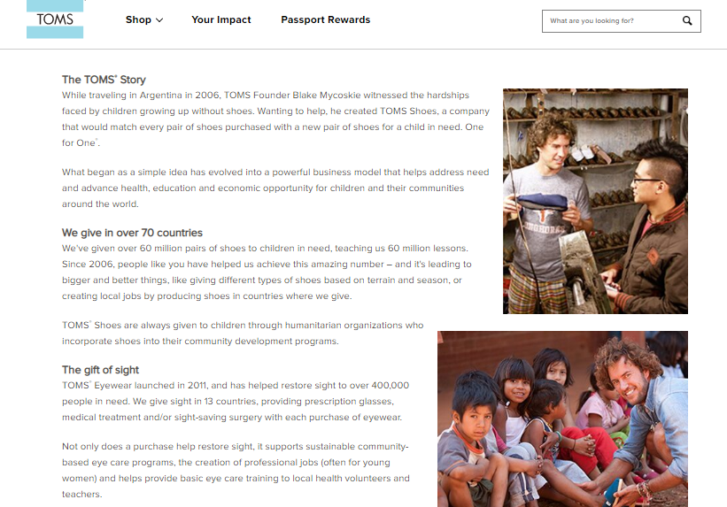
The first is your culture (about) page. This page is dedicated to talking about your company's story, goals, missions, customs, and values. Explain your daily operations and emphasize what your greatest competitive advantage is. Do you support any social issues? Discuss the things you do besides work. TOMS has the "Company Information" page, where they share their story and explain how they support important social issues.
Second, humanize your online presence to build customers' trust. The photos of your employees will show your customers that you're more than a business – you're a family that cares about its members. McDonald's has the "Our People" page, where they share employees' stories and testimonials, along with their photos.

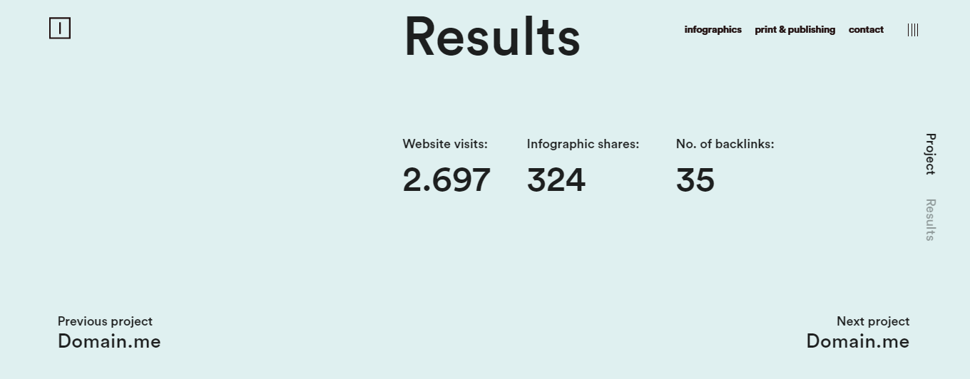
Finally, emphasize customer results. Create case studies for each client you’re working with. For example, the Infostarters creative agency has an entire page dedicated to their clients, where they discuss their projects and show how their design helped their clients. Previewing customer reviews on product pages or testimonials on your homepage will also work.
Simplicity and Clarity Boost Engagement
Simplicity and clarity mean that your visitors can find what they want faster. This is particularly important for your navigation. It needs to be user-friendly and straightforward.
For starters, use breadcrumb navigation. Just like in the famous story of Hansel and Gretel, the idea is to help a visitor see where they are on your site and help them click back to the previous pages.
You should also add a search box, preferably with auto-complete features, that will help your sales-ready leads find the right products faster.
Finally, optimize your drop-down menu. Include only relevant categories and subcategories. Above all, choose descriptive and logical names for them to help users find products faster.
Load Time Impacts Brand Image and Conversions
Modern online users expect websites to load in the blink of an eye. They don’t want to waste time on pages that have more than 3 seconds to load. In this case, they would simply ditch your website without converting. Worse yet, they will start spreading the negative word-of-mouth and never come back. Finally, your rankings may also suffer, given that website speed is among Google’s 200 ranking factors.
Now, there are numerous steps to take to improve website speed.
- Invest in a better hosting plan. With a dedicated hosting plan, you will have server space for yourself.
- Use a content delivery network (CDN) that loads content faster, regardless of users’ location.
- Remove frustrating auto-play media that uses a big chunk of mobile data and slows the page.
- Use lots of white space that makes your content easier to read and your pages faster.
- Optimize image sizes. There are many WP plugins and tools that will reduce image file size without compromising its quality.
Boosting Conversions

When you build relationships and engage visitors through impeccable design, the next step is converting them into leads and sales. Conversions are the ultimate goal of any marketing strategy, as your business wouldn’t survive and grow without them. Apart from the factors mentioned above, here are a few additional design elements that may make or break your conversions.
The first one is colors. Each color has its specific meaning and triggers a particular emotion in us. For example, many banks use blue because it stands for trustworthiness. Yellow is friendly, orange is energetic, while green is associated with growth and nature. Combine colors wisely. If you’re using cooler colors for your background, use warm colors for your CTA buttons to make them prominent.
The second is the personalization. No matter if they’re browsing through your blog or product pages, visitors expect you to recognize their needs, problems, and expectations and cater to them. For example, when a customer clicks on a product, you could provide them with “similar products” or “related products.”
Conclusions
Website design improves user engagement and inspires them to convert and come back to your site again. Above all, it turns one-time conversions into regular visitors and brand advocates and generates lots of positive word of mouth.
Do these tips work for your website? Is there anything you would like to add? We're listening!

