Guide to design an incredible app icon
The majority of people out there can not understand English or French but they can remember a catchy image.
There is no doubt that mobile apps have become a necessity for our daily life. We all are looking for an easy solution for every chore. This is the reason for successful businesses like Uber, Facebook, Postmates and Taskrabbit.
I am sure you too have an amazing app idea which can be a successful business. Thinking about an idea is easy; implementing it, in reality, is different. The most common hurdles come in our way are: hiring the right team for development, fitting it in our budget, marketing the app for your target audience.
It is important to keep in mind how you are going to handle the small and huge problems.
The biggest mistake we make while developing a mobile app.
Before hiring any team for the development of our application we prefer to check the costings.
The only thing that scares us during the entire process of application development is the cost to build an app. We try to save few bucks here and there as much as possible. This is a major reason that we neglect important aspects like creative and unique app design, easy to operate user interface and the most important one; your App Icon.
Neglecting the design of your app icon might save a few bucks but it will impact on your branding.
Why an app icon is important?
Their won't be any second chance to build your first impression.
Your app icon is your identity. Your app icon should be unforgettable to anyone who has seen it for once. It is the first thing your customers will see your company. Small details always have a big impact when it comes to designing. Your icon is the first brand interaction for your customers.
Whenever they will search for your app in the app store or play store they will see the icon in the list of apps with the same name.
Before moving further let us have a look at the two trends for designing: Material design and Flat design.
Material Design:
The material design mimics real-world objects with natural motions. It has realistic lighting, 3D effects, and animation features. Companies like Dropbox and Tumbler are using Material design.
Flat Design:
The flat design approach illustrates the minimalist approach. With clean and crisp corners, open space, two-dimensional illustrations, and bright colors, it is adopted by companies like Microsoft.
I have explained these two trends to help you understand what other brands are following to design the best app icon.
Here are a few tips to design the best app icon :
Follow the guidelines
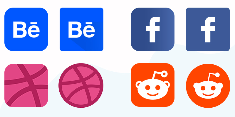
iOS and Android both have their design specific guidelines. For example, iOS automatically apply a rounded corner mask, hence the design at corners will be removed. Similarly, Android has its own geometric guidelines.

Memorable
Your icon should make its place in the mind of the users. An easy to memorize app icon will give you extra points in the competition. Competitors tend to build apps and their icons similar. A unique icon is easy to remember and hence helps your users to identify your app in the crowd. Try to avoid overcomplicated abstracts as much as possible.
Size matter!
An image that looks good in your PC might look too big or too small in other devices. Always make sure your icon looks the same in all devices and screens. Test your app in multiple devices to make sure the size of the app icon is not too large and not too small.
Target audience specific
Understand your target audience first. Know what they want, what are the likes and dislikes, what are the preferences and choices for different symbols. Make sure you are not hurting anyone’s sentiments.
Go for simplicity
Add simple shapes, words, and combinations in the icon. The best way to test the simplicity of your app icon is; show it to kids. Ask the kids to draw the icon by themselves. If they have drawn the icon 70 percent correct then you are good to go. If they are not able to understand your icon then you can ask them what's the most confusing or unwanted part.
Check with multiple backgrounds and colors
Your app will be downloaded by multiple users on multiple devices. Each device will be having a different wallpaper. Make sure your app icon is visible on all kinds of background designs, color combinations, and images.
Creativity comes from within
No doubt that creating an app icon is the work of a designer, but your ideas are also valuable. You are the only one who understands the exact essence of your application. Make sure to clearly explain what you expect from the designer. Don't expect the designer to read your mind.
Conceptualize
Instead of going for a logo with the first alphabet of the application name, try to create a concept. Sit with the designer and discuss what exactly you are going to serve with your application. If you have clarity about your mission and vision then only you can conceptualize the icon design.
Don't Ignore the Competitors
Check out the app icon of your competitors and never copy them. Copying the same design of the competitor and then just adding a few changes will affect your authenticity. Your consumers won't be able to trust you as a brand.
It time to outshine the crowd!!
Hire the top designers and give an extra bit of attention to the identity of your application. Keep in mind the above-mentioned points and you will get an amazing icon for your upcoming application. Make sure to test the icon along with the app design and functionality. Your logo is going to appear on almost everything related to your app; social media, flyer, business cards, advertisements, etc. Make sure you have the best one.


