Designing Search and Filter
Introduction
The Internet is a bustling marketplace, complete with flashy category shelves, colorful slogans, and gravity-defying 'value' deals. In fact, the Internet can be considered an endless supermarket; the virtual counters of an online store or resource library boast of more options than a large retail outlet ever can! However, these economies of scale come with a few daunting challenges. One of these limitations is 'search'. Searching for a product online and actually finding it in the vast abyss of virtual shelves, from across millions of product types, sizes, prices, colors, geographical variations, and many other such considerations is actually a Herculean task. An efficient search and filter criteria can make all the difference in conversion.
Why is 'Search' relevant?

To put it simply, you can't sell a product that your customers can't find. Search is a fundamental mobile activity and a critical element of building a profitable app or site. Users expect smooth in-app experiences when they are browsing for products with the intention of making a purchase. The app interface must assist the user in finding the product or service without encountering too many navigational obstructions. Data suggests that users typically make very quick judgments about the application's value based on the quality of one or two sets of search results. A search facility should help users find what they want quickly and easily.
Search is Contextual
Users browse product or service-oriented websites and apps in the pursuit of something. The search function must be efficient enough to connect the user to the object of their desire.
Let’s take two examples to compare the ‘Search’ function of two leading consumer-facing applications:
Netflix:All users who log in to the widely popular content streaming website, Netflix, are looking for something to watch. But since Netflix is an endless library of viewable content, how does the user find what they are looking for. The answer lies in the dynamic search bar. Positioned on the top-right corner of the homepage is the search criteria; it allows users to search for a movie based on their mood or choice by providing certain set of filters such as style, genres, language et cetera. The user intent is captured there.
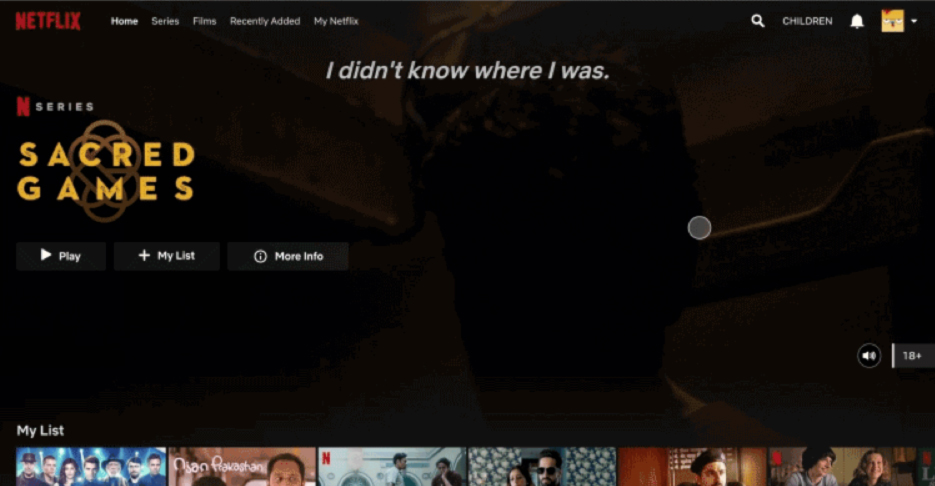
Netflix gives related titles along with the list of movies populating below - all curated through search patterns analyzed by Netflix. Hence, Netflix drives users to exactly what they are looking for leading to quick decision-making.
Medium: On the other hand, the search function on Medium could do with a little tweaking. The prompts in the search field do not direct the user with the method of the search and a new user can easily get confused on how to navigate the website for content. Medium must streamline the search function to reduce the cognitive load on the user.
There are two key areas of consideration when it comes to designing the ‘Search’ functionality in an app: Search box design and Result pages; lets's dig into them further
Search Box Design
A search box is a combination of an input field and the submit button. Since the search box is one of the most frequently used design elements on content-heavy websites/applications, its usability is critical. Let’s look into the basic sets of recommended practices to be followed for Search box design:
One very important rule in search box design is its placement. The intention is to make the search function easily noticeable. Especially, where the search is an important function, it should be upfront, as it might serve as the fastest route to discovery. Search hidden under navigations or under icons has negative consequences. Below are the points to consider while placing your search field:
Prominently Display The Search Field
As a thumb rule search box should be the first or the second thing a user should see when they open the app. They need not necessarily be full length or wide open. To decide which style of search box to adopt, one needs to analyze the user motivation/goal for using that app. The placement of the search bar is dependent on the nature of the website and the product or services they offer. Let's review the search option in some leading websites.
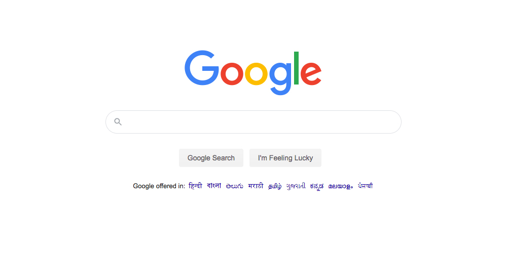
The primary goal of Google is search. Hence, the search engine has a wide search bar placed strategically in the middle of the page.
Amazon
The primary goal of users on Amazon is not search. A lot of users on e-commerce sites browse for products. Hence, the e-commerce website has been designed with a visible search bar and not a full-width search box.

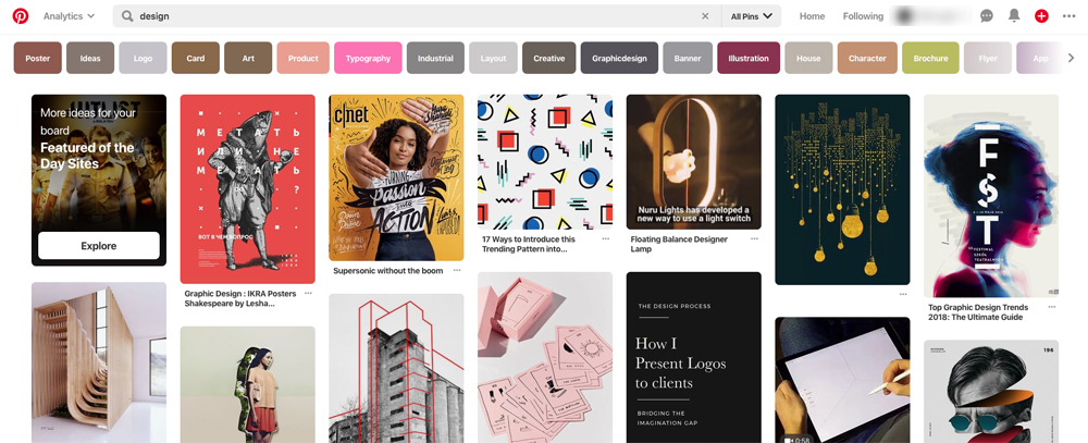
Interestingly Pinterest has a different approach for both mobile and web interfaces. The web has a wide-open search box along with a few other options, but the mobile interface has an icon-only search approach. This is because most users on Pinterest browse creations rather than searching for a specific thing.
In shorts
With inshorts, a different scenario manifests; the purpose of this application is to help users with a quick understanding of the news categories of their liking. The app identifies the interest areas of the users during the onboarding process itself. In case a user wants to search anything they tap on the 'Discovery' bar leading to search for news based on any categories/topics.

Proper Size of Input field
The size of the input field is an important area for deliberation as it directly affects the usability of the app. Data suggests that 90% of the search queries are approximately 27 characters in length; this metric can be used as a yardstick while deciding the length of the input field.
Use magnifying-glass icon

The magnifying glass icon is the universal symbol of search. Using the common and easily identifiable context reduces the cognitive load from users and helps them in quick understanding. We suggest to use the simplest version of the magnifying glass, not everything needs to be innovated!
Provide a search button for the search box
Typing out a query in the input field must be complemented by a trigger action, ie, pressing the search button. A button helps people recognize that there's an additional step to trigger the search action.

While designing the button, two considerations have to be taken; first, the button must be sized appropriately, so that users don’t have to point the mouse very precisely on a certain spot. A larger clickable area makes it easier to spot and to click. Second, to let users submit a search query using the ‘Enter’ button on the keyboard as well as on clicking the icon. Many users still have the habit of clicking an actual button to submit the search.
Prompt what users search for (hint text)
It's a good practice to let users know what all they can search for. It's advisable to include a hint text in the input field to serve as examples of how queries can be worded. While designing the prompt, limit your hint to just a few words; remember we don't want to overwhelm our users.
Use the auto-suggestion mechanism

We all love the query suggestions that Google throws on us while searching, it's just easier, ain't it? In most websites/apps that include search as a key function, formulating a search query includes a specific logic or algorithm. Autosuggestion feature not only reduces keystrokes but also suggest more accurate terms to enable the users' search process.
Show recent searches
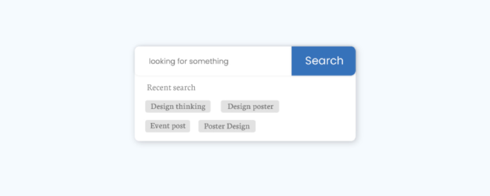
A key usability rule in user experience dictates that we as designers, respect the users' effort. Apps should store all recent searches, in order to provide this data to the user the next time they conduct a search. It saves screen-time and effort in searching for the same item again and increases conversion.
Result Pages
The results page is a crucial piece of the puzzle and defines the search experience for the app. Here are some effective pointers for delivering a functional 'results' page.
Retain the users' search query even after the initial 'Search'
Data suggests that most users will not find accurate search results in the first try and will hence, try to search again by making slight modifications to the original query. For the sake of simplicity, leave the initial search term in the search box so that users don't have to re-type the entire query again.
For example, Youtube retains users' search queries after they have submitted their search request (Good experience) while Amazon erases the same (poor experience). As per the usability principle of design, Youtube ranks higher than the e-commerce giant since it prevents the duplication of user effort to look for items on the site. Youtube saves recent searches as well as content that is frequently searched by an individual user to suggest customized playlists for their target audience.
Select a proper layout for your data
Search is no longer restricted to text. The layout of search pages must suit the content that it seeks to display. Two popular layouts for content presentation are:
- List view: This format is better suited to display text-based search results with details of different articles or listicles arranged in the order of relevance. This layout format is also preferred for technical products that involve technical information in the summary to aid users’ decision-making process. Google employs the list view for its traditional keyword-based search.
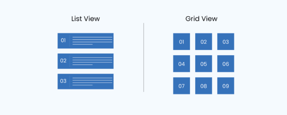
- Grid view: This layout is suitable for any application that is visual or image-oriented. A popular example of the grid view layout is Instagram which is primarily an image sharing platform for its registered users. This layout is largely preferred by lifestyle and apparel retailers who seek to create visual distinctions between items to enable a healthy differentiation between their products.
Tip:Allow users to choose ‘list-view’ or ‘grid-view’ for search results. This gives your users the ability to choose how they view their results in a way preferable to them. Soundcloud is a good example of this hybrid approach.
Display the number of matching results

The result pages must display all the relevant matches to the search query entered in decreasing order of relevance with the most accurate search results on top. If your design can showcase the total search results, the number of search items available; Users can make informed decisions on how long they want to spend looking through results. This has been nailed by company Awwwards as they display the search matches by type, relevance and reach on the top of the page.
Show search progress
The average attention span of a human being is depleting as we speak. Data suggests that in this day and age of constant digital bombarding, our ability to direct our attention on something is down to 8 seconds of focus time. This makes it crucial for us as designers to not only build systems that deliver results faster, if not immediately, but also display a progress indicator to keep the user engrossed. This gives them a clear indication of how long they have to wait, while we collate results behind the scenes.
If the search takes more than 10 seconds, its advisable to use animation. Fine animation can distract your users and make them ignore long searching times. Here are two techniques that work:
- Using Micro-interactions: Using illustrations, animations, and small games are fun ways to keep users engaged as the result page loads. Paytm flight search animation would be a good example.

- Lazy Loading: As the name suggests, lazy loading is a technique that loads partial results while the entire gamut of matched results are in the process of being delivered. Since the initial content to be displayed is limited, the initial page is loaded quickly which keeps the user engaged while the rest is retrieved for display. A few e-commerce websites use this method actively.

Don't show ''No results''

As a user, nothing can be quite as frustrating as the search query delivering zero relevant results. This is especially true for someone if they have tried multiple times without success. Here’s how you can navigate this situation without aggravating the end user.
- Clearly explain that there are no matching results.
- Offer starting points for moving forward. An e-commerce store can suggest related products from similar categories on the no-results page.
Sorting and filtering
Sort and filter options are the unsung saviors of online search. Sifting through a plethora of options online enlisted one after the other can be an exhausting task; filters simplify this task by narrowing the displayed results to reflect items as per the user’s need and not the entire universe of ‘related’ products. Filter & sort options are the sub-elements of any search as they can help users narrow and organize their search results, which otherwise requires extensive scrolling or pagination on a small screen.
However, it’s important not to overwhelm users with too many options. If your search requires a lot of filters, then some of these filters should collapse by default. Also, once the filter/sort is applied by the user then a button called ‘Reset Filters’ or ‘’Clear All’’ should be given next to the filters/sort so that the user can quickly make changes.
Conclusion
Search is a crucial, complex, and expensive feature. It has the potential to make or break an app because it serves as an important experience tool for the users. With the ever-changing technology, let’s embrace ourselves into a completely new world of search design. Today search is no longer limited to text; different formats of search queries can be submitted in a search box in any application/website. Are we ready for it and thinking about them? Below are some examples of popular alternative search formats, do let us know what are your design techniques for them.
Voice Search:

Voice search uses the power of speech recognition to search the web instead of the traditional typed text. It is becoming an increasingly popular technique as it saves a lot of effort and time.
Reverse Image Search:

Unlike traditional search which requires accuracy in both recognizing relevant keywords as well as designing a search query, the reverse image search is a mechanism that relies entirely on images. It is characterized by a lack of search terms. Reverse image search also allows users to discover content that is related to a specific sample image and locate the source of the image for various purposes of use. These images when discovered via search queries can provide links to the content creator and their other work.
Image Pattern Recognition (Eg: Google lens):

Google lens is another type of example when it comes to various types of searches. Instead of simply identifying what an object is, Google Lens can understand the context of the subject. So if you take a picture of a flower, Google Lens will not just identify the flower, but provide you with other helpful information, like where there are florists in your area. It also does useful things like scanning QR codes, copying written text, and even live translation of other languages.
Music Recognition Search (Eg: Shazam, SoundHound, Musixmatch lyrics):

Shazam, Sound Hound, Musixmatch lyrics are those applications that help users to search/figure out the name of a catchy song being played on the radio, television or other place. Users simply hold their device up to the speaker playing music and these applications will attempt to identify the tune's album, artist and song title.


