11 Mar 2023 App Of The Day
Air Quality Index - AQI
by Maps&Charts;
Description
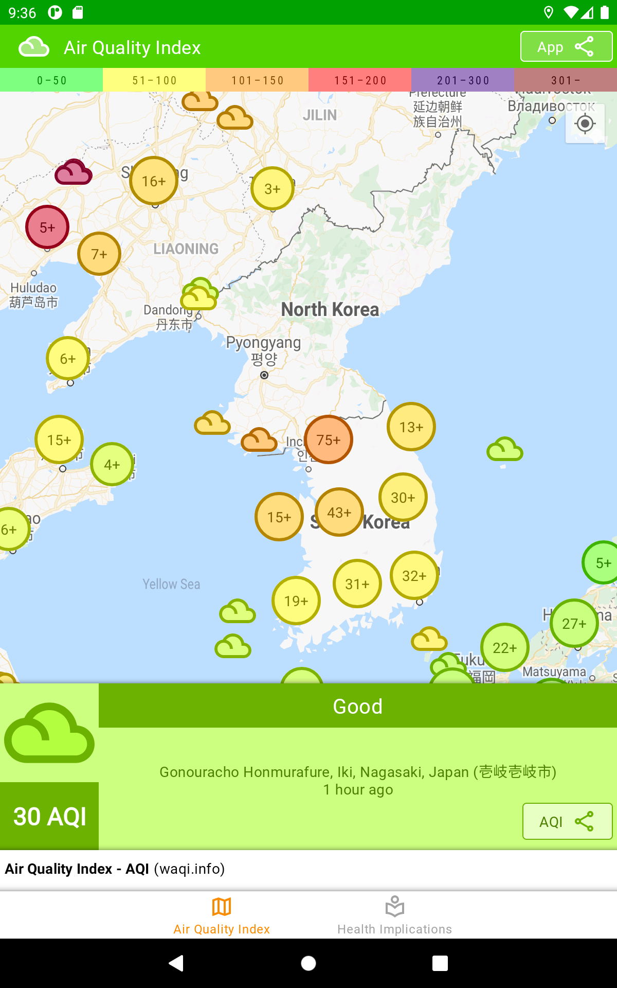
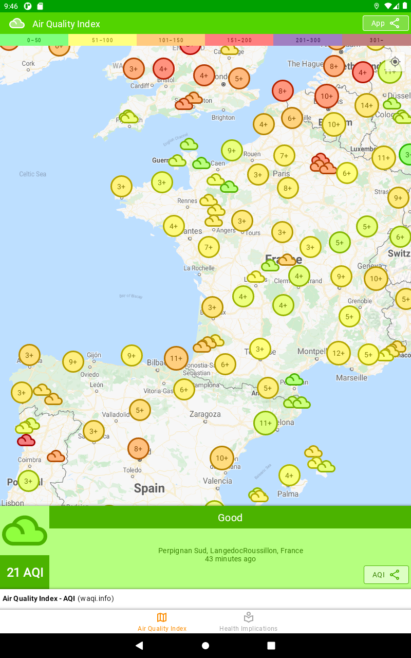
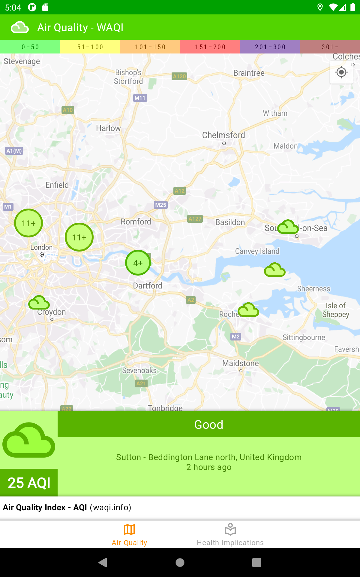
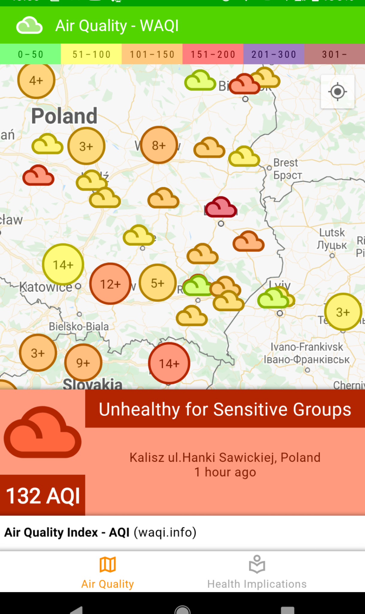
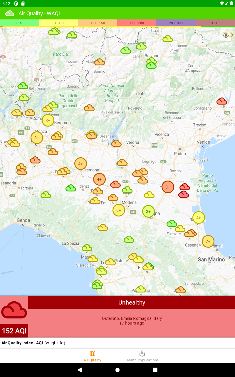
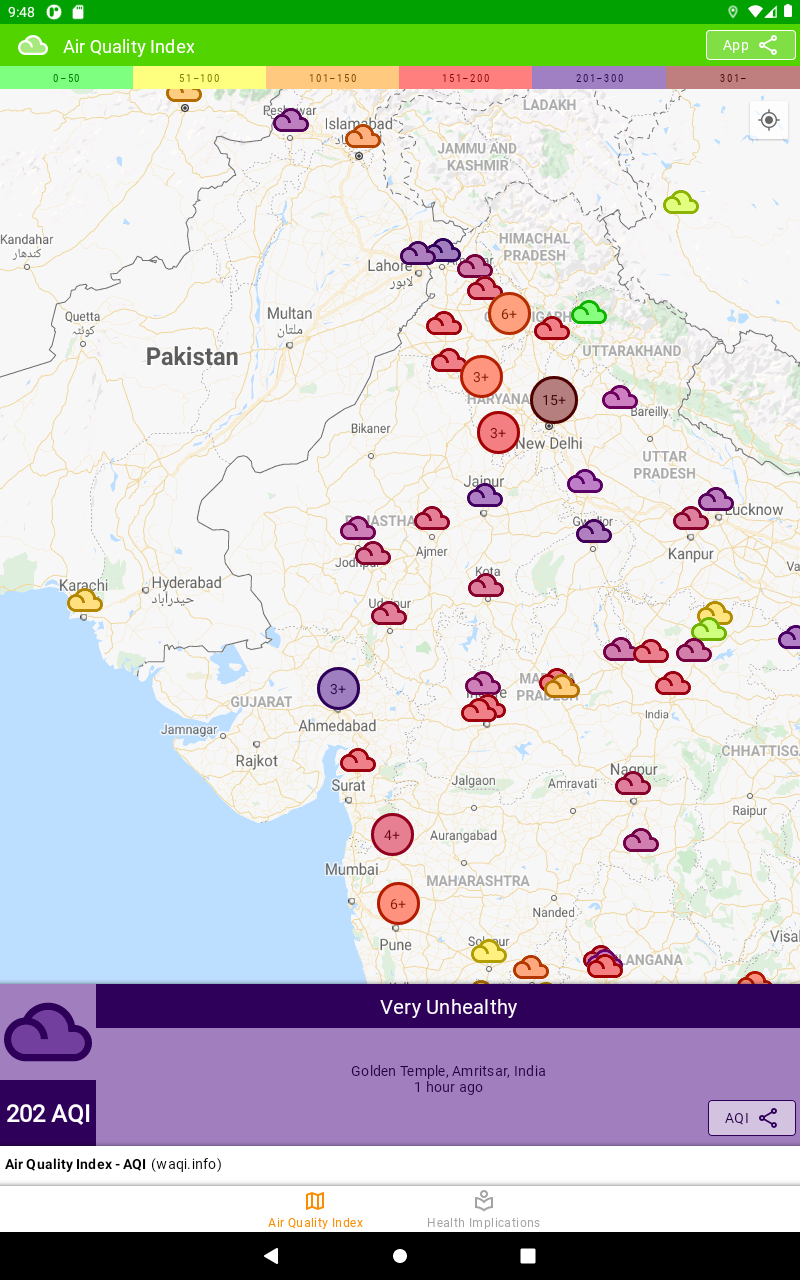
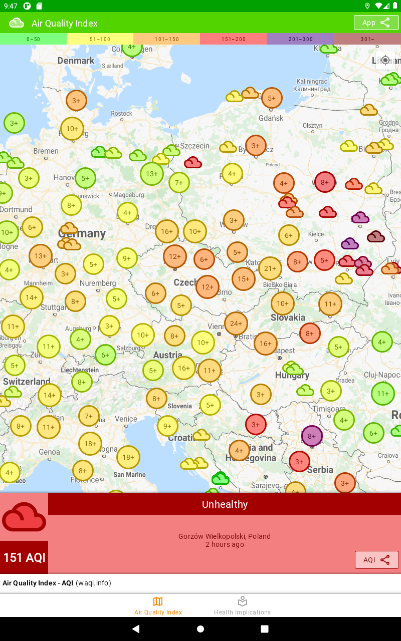
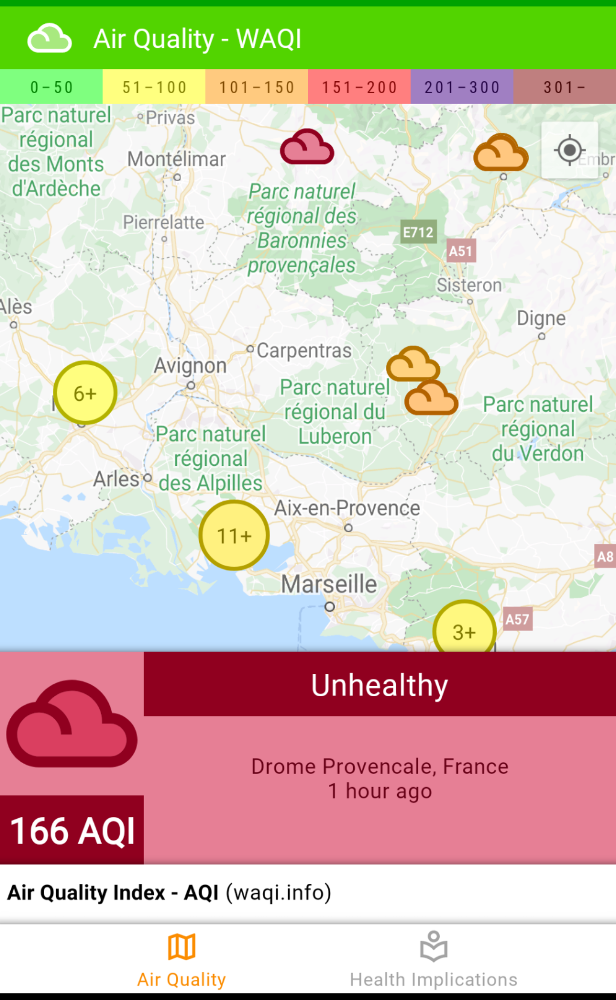
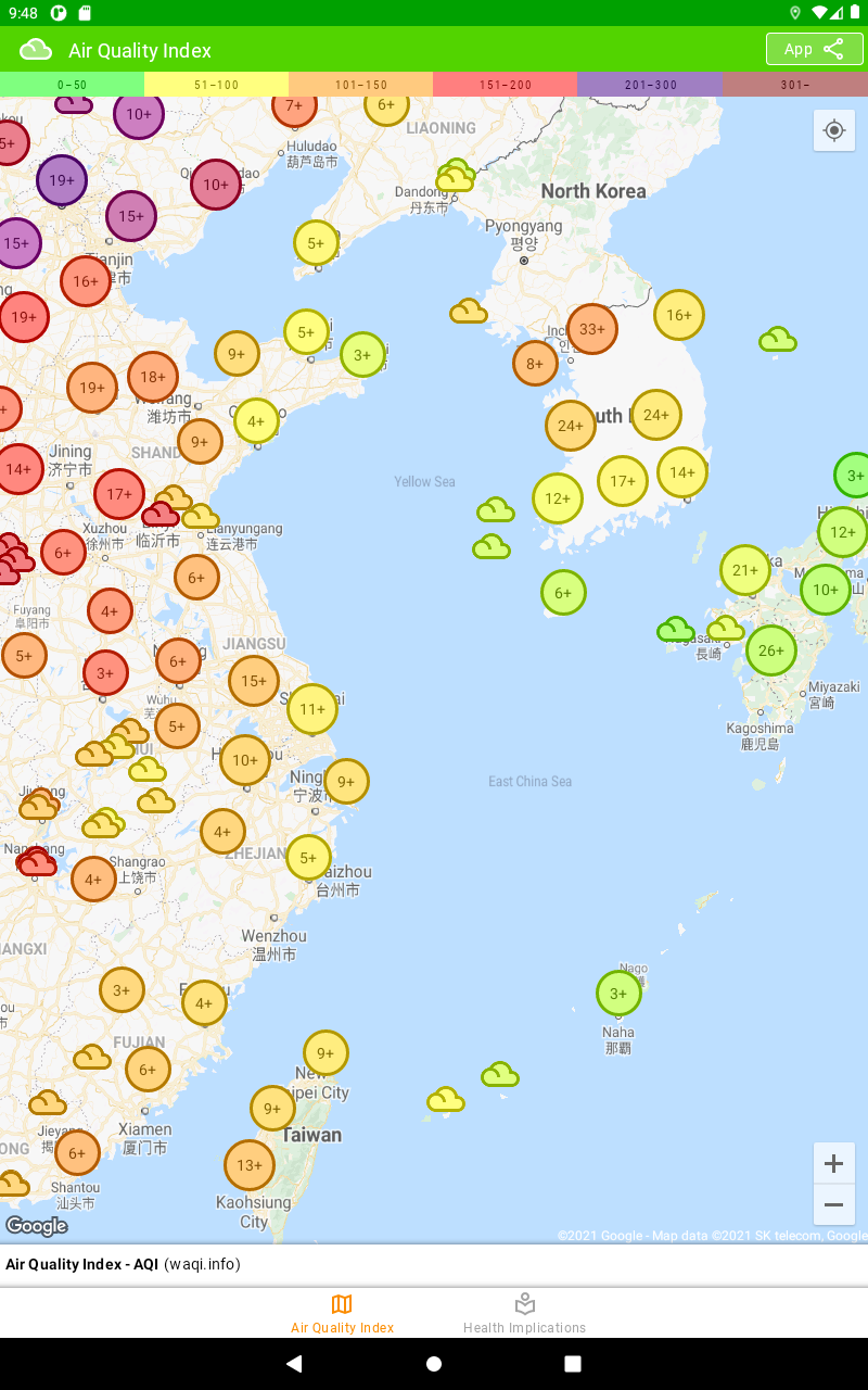
Map shows AQI information for many countries in North and South Americas, Europe, Asia and Australia.
The Air Quality Index is based on measurement of:
- ground-level ozone
- particle pollution (also known as particulate matter, including PM2.5 and PM10)
- carbon monoxide
- sulfur dioxide
- nitrogen dioxide
Most of the stations on the map are monitoring both PM2.5 and PM10 data, but there are few exceptions where only PM10 is available.
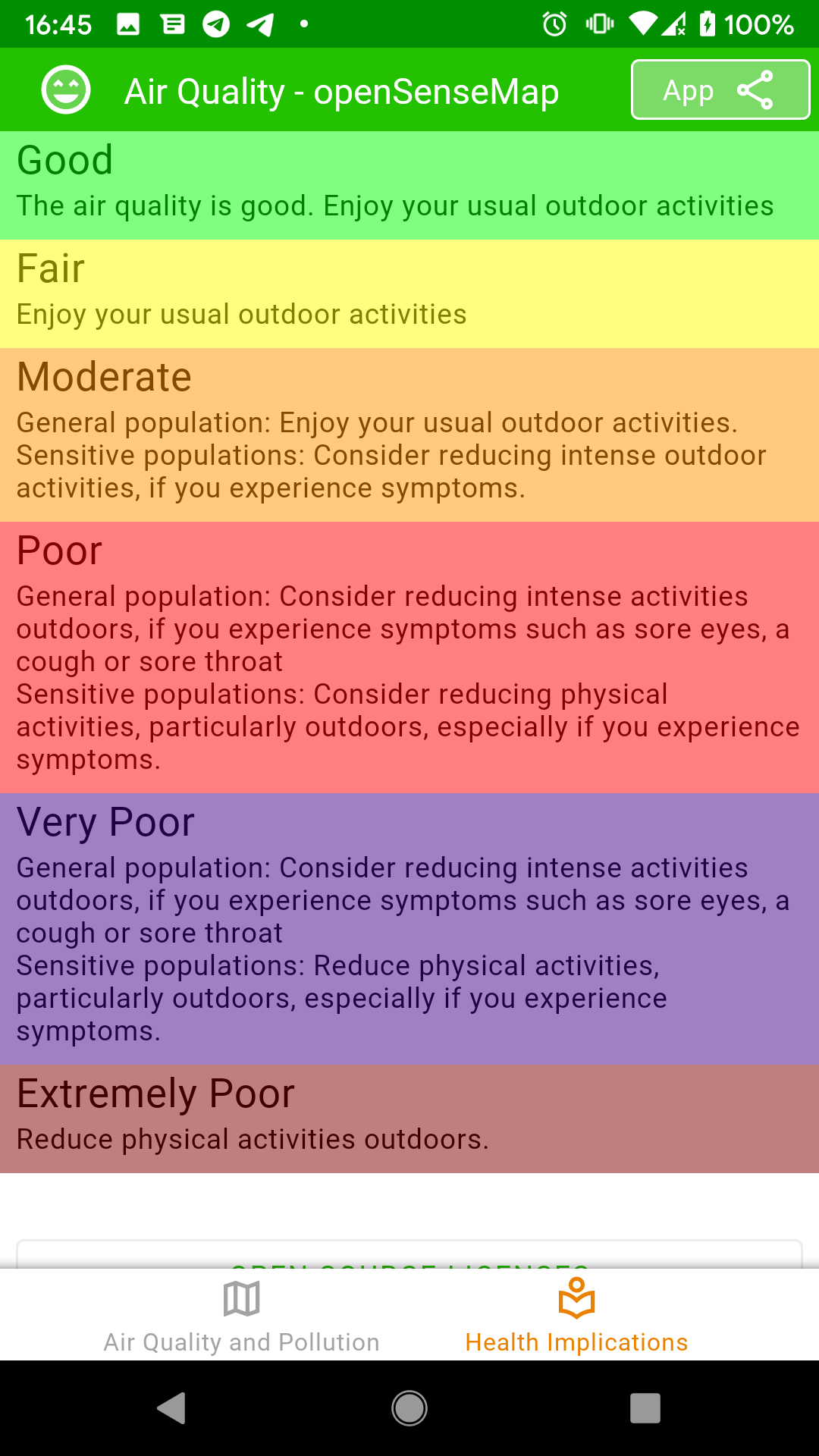
The AQI is divided into six categories. Each category corresponds to a different level of health concern. Each category also has a specific color. The color makes it easy for people to quickly determine whether air quality is reaching unhealthy levels. The higher the AQI value, the greater the level of air pollution and the greater the health concern.
Data provided by World Air Quality Index Project (waqi.info and aqicn.org)
Related Apps
-
AOTD
VariFlight-Live on Time
by Feeyo Technology Co. Ltd.
3041 -
100% Brain Capacity Brainwaves
by allseo
1398 -
ViaMe
by ViaMe
2196


